If only a small share of your visitors accepts cookies on your site, there are small (and legit, of course) tweaks you can make to improve your performance.
What is my cookie banner opt-in rate, and why does it matter?
Your opt-in rate is the percentage of visitors who consent to cookies when they land on your site. It’s the share of people who click “Accept.”
Why does it matter? Because without consent, most of your analytics, advertising, and personalization tools don’t fire. This negatively impacts your retargeting, attribution, and conversion tracking data.
A low opt-in rate means a less complete picture of your users and less effective campaigns. Getting more people to say yes, genuinely and legally, is worth the effort.
Here are five mistakes that may be keeping your rate low.
1. Your cookie banner loads too slowly
A banner that appears after the rest of your page has loaded, or causes content to jump as it slides in, creates a poor first impression. Some visitors may leave before they even see it.
A slow or disruptive banner signals low quality before the user has read a single word. It also makes the consent interaction feel like an afterthought rather than something you take seriously. That perception matters.
Fix it: Make sure your banner loads quickly and doesn’t shift the page as it appears. Choose an overlay banner that sits on top of your content rather than pushing it down. Test on mobile too, where performance issues tend to be more noticeable. Use a trusted CMP provider that performs well in terms of speed.
2. You’re making it too hard to choose
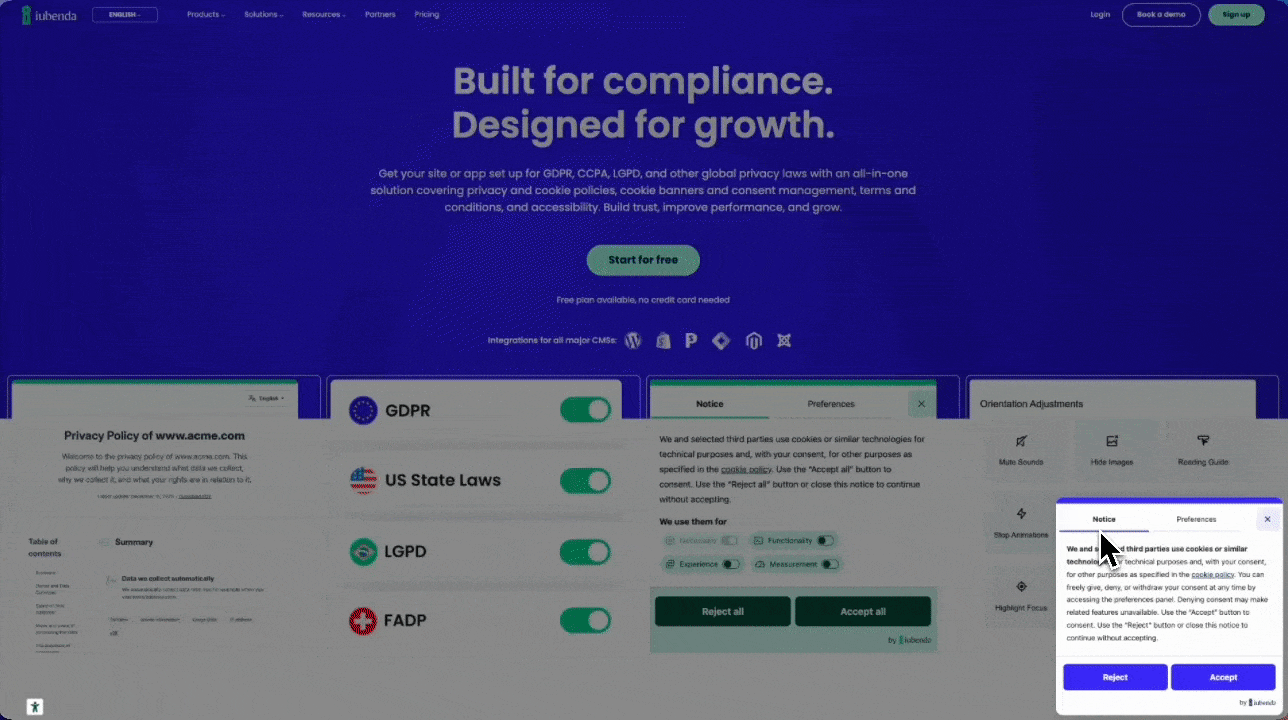
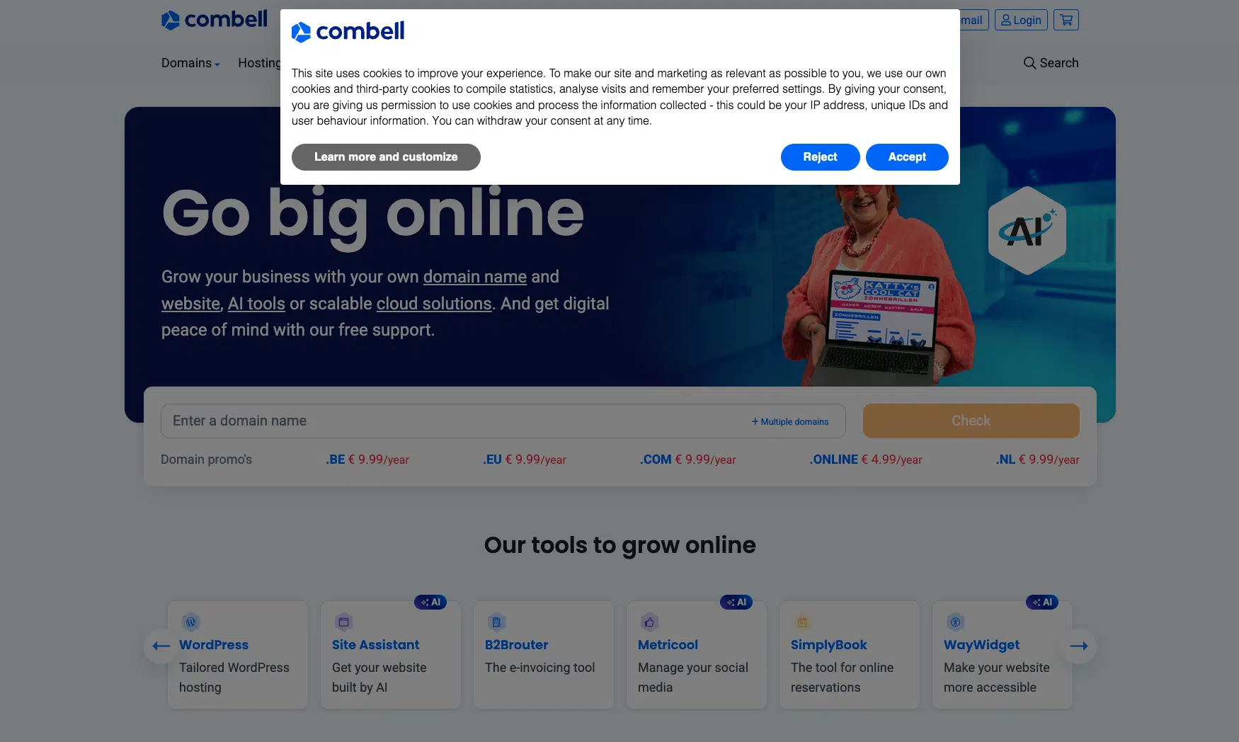
Consent is only valid when it’s freely given. That means accepting and rejecting cookies needs to feel equally straightforward. The most obvious form of friction is visual: a bold “Accept” button paired with a barely visible “Reject” link.
Friction shows up in other ways, too:
- Too many steps to manage preferences.
- A preference center that buries options behind layers of clicks.
- Category names that are vague or confusing.
- A layout that guides users toward one outcome while making the other feel deliberately difficult.
The CNIL has issued formal compliance notices to websites where rejecting cookies was harder than accepting. noyb found that 81% of the 500+ banners it examined had no visible reject option on the first layer.
Beyond the legal risk, a frustrating experience damages trust.
Fix it: Give “Accept” and “Reject” equal visual weight on the first layer. Keep your preference center simple and easy to navigate for anyone who wants to customize. If a user can manage their choices quickly and confidently, you’ve done it right.
3. You’re not explaining why
“We use cookies. Accept or decline.” gives visitors no reason to say yes.
People are more likely to consent when they understand what their data is used for and feel it’s a fair exchange. A single plain-language sentence changes the dynamic entirely. “We use analytics to understand how visitors use this site” is clearer and more trustworthy than a generic legal blurb.
Fix it: Add one short sentence to your banner explaining what consenting to analytics or marketing cookies actually means for the user. Don’t use legal jargon.
4. You’re not using your CMP’s built-in features
Most CMPs come with tools designed specifically to improve consent rates. Two worth using right away:
- Rejection recovery re-engages users who declined. Instead of losing them entirely, it displays a notice where blocked content would appear and invites them to revisit their preferences. It’s not manipulative: it shows users what they’re missing and gives them a genuine second chance to choose.
- A/B testing lets you compare banner designs, button labels, and copy to see what earns more genuine opt-ins. Small changes can make a meaningful difference over time.
Fix it: Open your CMP dashboard and explore what’s available. iubenda’s Privacy Controls & Cookie Solution includes rejection recovery. iubenda by consentmanager has a great A/B testing feature.
5. Your banner doesn’t look right on your site
A generic banner can undermine trust before a user reads a single word. If it doesn’t match your brand, it feels like a third-party interruption rather than a natural part of the experience. That affects whether people engage with it at all.
Design and placement both play a role here. On the design side, use your brand colors, fonts, and visual style, and add your logo if your CMP supports it. A banner that looks like it belongs builds confidence and signals care. For placement, bottom-right performs particularly well on desktop: it sits within the natural reading flow without blocking content.
Fix it: Customize your banner to match your brand. Test different positions, starting with bottom-right on desktop. Track changes in your consent rate through your CMP analytics and adjust from there.
A note on doing this right
Higher cookie banner opt-in rates only count if they reflect genuine consent. Under the General Data Protection Regulation (GDPR), nudging users into clicking “Accept” through deceptive design (also called dark patterns) doesn’t create valid consent and exposes you to legal risk.
These fixes aren’t tricks. They’re improvements to speed, transparency, clarity, and user experience. When your banner works well, users understand what they’re agreeing to. The ones who say yes mean it. That’s better data, more effective marketing, and valid consent.