AMP
- Disable AMP entirely for those posts that can’t be rendered with AMP or that it’s simply not worth having AMP enabled on (e.g. the Getting Started one which will hardly get any traffic from mobile google searches)
- Hide any sections with the
.hide-from-ampclass that are not rendering/working in AMP (e.g. the NL signup form and the quiz)
Boxes
Note: if you don’t have a title, but just a short paragraph you want to box/highlight (for example an invite to take a quiz), you can use this code:
<div class="my-4 rounded p-3 bg-fade">
    <p class="mb-0">...</p>
</div>
Classes/Colors:
bg-fadefor graybg-notefor bluebg-important for redbg-yellowfor yellow
Result:
💡 Take this 1-min quiz to find out which laws are actually relevant for you
Gray
Code:
<div class="my-4 rounded p-3 bg-fade">
    <h4 class="mt-3">Optional title</h4>
    <p>...</p>
</div>
Result:
Title goes here if applicable
This is a test test2 test3 test4 box for “big” chunks of text that you may want to highlight. While this box should be used for longer bits of text, you can also use this box for shorter information points – in place of the blue info box below – IF you feel like the particular section of the post has too much color, or if the blue box takes away attention from an image (use your discretion here).
This box can be used with or without the h4 “[Title]”.
Note
Code:
<div class="my-4 rounded px-3 pt-3 pb-1 bg-note">
    <h5 class="my-2">Note</h5>
    <p>...</p>
</div>
Result:
Note
This box can be used in general for highlighting short information points (use the gray for the longer text) and therefore can be used with or without the h5 “Note” title.
Important
Code:
<div class="my-4 rounded px-3 pt-3 pb-1 bg-important">
    <h5 class="my-2">Important</h5>
    <p>...</p>
</div>
Result:
Important
This box should be used for highlighting critical points and should be used with the h5 “Important” title
Caution
Code:
<div class="my-4 rounded px-3 pt-3 pb-1 bg-caution">
    <h5 class="my-2">Caution</h5>
    <p>...</p>
</div>
Result:
Caution
This box should be used for highlighting points that require extra attention but are not necessarily critical. It should be used with the h5 “Caution” title.
Webinar
Use the WP reusable blocks called “Attend our free webinars” (en) and “Partecipa ai nostri webinar” (it).
Code:
<div class="card my-5">
    <div class="d-none d-sm-block" style="width:54px; height: 54px; background: #fff; border-radius: 50%; position: absolute; top: -27px; left: -27px; font-size: 25px; text-align: center; line-height: 54px; border: 1px solid rgba(0,0,0,0.125);">🎙️</div>
    <div class="p-4">
        <h5>Ask our experts live</h5>
        <hr>
        <p class="card-text"><strong>View live demos and have your questions answered in real time</strong> by attending one of our free English webinars. They are all practical and designed to really help you with understanding and achieving compliance for your websites or apps.</p>
        <a href="https://iubenda.link/webinars" target="_blank" class="btn btn-primary text-white sans-serif">Attend our free webinars</a>
    </div>
</div>
Result:
Ask our experts live
View live demos and have your questions answered in real time by attending one of our free English webinars. They are all practical and designed to really help you with understanding and achieving compliance for your websites or apps.
Attend our free webinarsButtons
Note: wide buttons on small screens are responsive by default on help pages. Outside the help section you should add the .btn-cta-responsive class.
Small Green (not centered)
Code:
<div class="py-5">
    <a class="btn btn-primary text-white sans-serif" href="https://www.iubenda.com/p">Visit iubenda.com</a>
</div>
Result:
Small Gray (with modal)
Code:
<div class="text-center py-5 hide-from-amp">
    <a class="btn btn-dark-gray txt-dark sans-serif" href="#" data-toggle="modal" data-target="#withModal">Open a modal</a>
</div>

<div class="modal fade" id="withModal" tabindex="-1" role="dialog" aria-labelledby="withModalLabel" aria-hidden="true">
    <div class="modal-dialog modal-lg" role="document">
        <div class="modal-content">
            <div class="modal-header">
                <h5 class="modal-title" id="exampleModalLabel">Modal title</h5>
                <button type="button" class="close" data-dismiss="modal" aria-label="Close">
                    <span aria-hidden="true">×</span>
                </button>
            </div>
            <div class="modal-body">...</div>
        </div>
    </div>
</div>
Result:
2 buttons
Code:
<div class="text-center my-5">
    <a class="btn btn-primary text-white sans-serif mx-2 my-2" href="#">View and export</a> or <a class="btn btn-primary text-white sans-serif mx-2 my-2" href="#">Download</a>
</div>

<div class="text-center my-5">
    <a class="btn btn-dark-gray txt-dark sans-serif mx-2 my-2" href="#">View and export</a> or <a class="btn btn-dark-gray txt-dark sans-serif mx-2 my-2" href="#">Download</a>
</div>
Result:
Big Green (with lightbox)
Code:
<div class="text-center py-5 hide-from-amp">
    <a class="btn btn-xl btn-primary text-white px-5 py-3 text-lg sans-serif lightbox" href="https://www.iubenda.com/start-generating?wizard=true">Start generating</a>
</div>
Result:
Big Green + Title
Code:
<div class="text-center my-5 py-5 hide-from-amp">
    <h2 data-toc-skip>Create a privacy policy for Google Analytics</h2>
    <a href="https://www.iubenda.com/start-generating?wizard=true" class="btn btn-xl btn-primary text-white px-5 py-3 mt-4 text-lg sans-serif lightbox">Start generating</a>
</div>
Result:
Big Green + Title + Short Paragraph (with CS lightbox)
Code:
<div class="text-center my-5 py-5 hide-from-amp">
    <h2 data-toc-skip="">Manage cookie consent with the Cookie Solution</h2>
    <p class="mt-2 mb-3">All you need for the EU Cookie Law: cookie banner, prior blocking and asynchronous re-activation</p>
    <a class="btn btn-xl btn-primary text-white px-5 py-3 mt-2 text-lg sans-serif lightbox" href="https://www.iubenda.com/start-generating?redirectUrl=%2Fen%2Fcookie_solutions%2Fnew%3Fsite_id%3D%25%7BsiteId%7D&wizard=true" data-modal-size="large">Generate a cookie banner</a>
</div>
Result:
Big Gray
Code:
<div class="text-center py-5 hide-from-amp">
    <a class="btn btn-xl btn-dark-gray txt-dark sans-serif" href="https://www.iubenda.com/p">Visit iubenda.com</a>
</div>
Result:
Code
Use Gutenberg’s code block and add prettyprint linenums js-code into block’s Advanced > Additional CSS Class. Result:
<input type="text" name="email" data-cons-subject="email" />
<input type="password" name="password" data-cons-exclude />
We may optionally add the pre-scrollable class, which will set a max-height of 350px and provide a y-axis scrollbar. Result:
<!-- Twitter -->
<meta name="twitter:card" content="summary">
<meta name="twitter:site" content="@getbootstrap">
<meta name="twitter:creator" content="@getbootstrap">
<meta name="twitter:title" content="Code">
<meta name="twitter:description" content="Documentation and examples for displaying inline and multiline blocks of code with Bootstrap.">
<meta name="twitter:image" content="https://getbootstrap.com/docs/4.0/assets/brand/bootstrap-social-logo.png">

<!-- Facebook -->
<meta property="og:url" content="https://getbootstrap.com/docs/4.0/content/code/">
<meta property="og:title" content="Code">
<meta property="og:description" content="Documentation and examples for displaying inline and multiline blocks of code with Bootstrap.">
<meta property="og:type" content="website">
<meta property="og:image" content="http://getbootstrap.com/docs/4.0/assets/brand/bootstrap-social.png">
<meta property="og:image:secure_url" content="https://getbootstrap.com/docs/4.0/assets/brand/bootstrap-social.png">
<meta property="og:image:type" content="image/png">
<meta property="og:image:width" content="1200">
<meta property="og:image:height" content="630">
We can highlight code variables like sendFromLocalStorage with the code tag.
Collapse
Accordion
Code:
<div class="accordion" id="accordionExample">

    <div class="card">
        <div class="card-header" id="headingOne">
            <h5 class="mb-0">
                <button class="btn btn-link pl-0 collapsed" type="button" data-toggle="collapse" data-target="#collapseOne" aria-expanded="false" aria-controls="collapseOne">
                    Collapsible Group Item #1
                </button>
            </h5>
        </div>
        <div id="collapseOne" class="collapse" aria-labelledby="headingOne" data-parent="#accordionExample">
            <div class="card-body">
                <p>...</p>
            </div>
        </div>
    </div>

    <div class="card">
        <div class="card-header" id="headingTwo">
            <h5 class="mb-0">
                <button class="btn btn-link pl-0 collapsed" type="button" data-toggle="collapse" data-target="#collapseTwo" aria-expanded="false" aria-controls="collapseTwo">
                    Collapsible Group Item #2
                </button>
            </h5>
        </div>
        <div id="collapseTwo" class="collapse" aria-labelledby="headingTwo" data-parent="#accordionExample">
            <div class="card-body">
                <p>...</p>
            </div>
        </div>
    </div>

    <div class="card">
        <div class="card-header" id="headingThree">
            <h5 class="mb-0">
                <button class="btn btn-link pl-0 collapsed" type="button" data-toggle="collapse" data-target="#collapseThree" aria-expanded="false" aria-controls="collapseThree">
                    Collapsible Group Item #3
                </button>
            </h5>
        </div>
        <div id="collapseThree" class="collapse" aria-labelledby="headingThree" data-parent="#accordionExample">
            <div class="card-body">
                <p>...</p>
            </div>
        </div>
    </div>

</div>
Result:
Anim pariatur cliche reprehenderit, enim eiusmod high life accusamus terry richardson ad squid. 3 wolf moon officia aute, non cupidatat skateboard dolor brunch. Food truck quinoa nesciunt laborum eiusmod.
Brunch 3 wolf moon tempor, sunt aliqua put a bird on it squid single-origin coffee nulla assumenda shoreditch et. Nihil anim keffiyeh helvetica, craft beer labore wes anderson cred nesciunt sapiente ea proident.
Anim pariatur cliche reprehenderit, enim eiusmod high life accusamus terry richardson ad squid. 3 wolf moon officia aute, non cupidatat skateboard dolor brunch. Food truck quinoa nesciunt laborum eiusmod.
Brunch 3 wolf moon tempor, sunt aliqua put a bird on it squid single-origin coffee nulla assumenda shoreditch et. Nihil anim keffiyeh helvetica, craft beer labore wes anderson cred nesciunt sapiente ea proident. Ad vegan excepteur butcher vice lomo. Leggings occaecat craft beer farm-to-table, raw denim aesthetic synth nesciunt you probably haven’t heard of them accusamus labore sustainable VHS.
Brunch 3 wolf moon tempor, sunt aliqua put a bird on it squid single-origin coffee nulla assumenda shoreditch et. Nihil anim keffiyeh helvetica, craft beer labore wes anderson cred nesciunt sapiente ea proident.
Ad vegan excepteur butcher vice lomo. Leggings occaecat craft beer farm-to-table, raw denim aesthetic synth nesciunt you probably haven’t heard of them accusamus labore sustainable VHS.
Titles
Code (pay attention to data-target and id):
<div class="collapse-single mb-3">
    <h2 style="cursor: pointer;" data-target="#collapse-one" data-toggle="collapse" aria-expanded="false" data-toc-skip>This title hides collapsed content</h2>
    <div id="collapse-one" class="collapse">
        ...
    </div>
</div>
Result:
This title hides collapsed content
Anim pariatur cliche reprehenderit, enim eiusmod high life accusamus terry richardson ad squid. Nihil anim keffiyeh helvetica, craft beer labore wes anderson cred nesciunt sapiente ea proident.
Changelog
Changelog and current version / Changelog e versione più recente
Code:
<div class="collapse-single my-5">
    <h2 style="cursor: pointer;" data-target="#changelog" data-toggle="collapse" aria-expanded="false" data-toc-skip>Changelog and current version</h2>
    <div id="changelog" class="collapse">
        <h5>1.1.3</h5>
        <p>Fixed various bugs related to the new parsing engine introduced in 1.1.0</p>

        <h5>1.1.0</h5>
        <p>Intro of a new experimental parsing engine<br />
            Now detects Google maps automatically</p>

        <h5>1.0</h5>
        <p>First plugin version</p>
    </div>
</div>
Result:
Changelog and current version
1.1.3
Fixed various bugs related to the new parsing engine introduced in 1.1.0
1.1.0
Intro of a new experimental parsing engine
Now detects Google maps automatically
1.0
First plugin version
Elevio
Chat
Use <a href="#" data-elevio-module="9" data-elevio-style="nothing">...</a> to open the Elevio chat.
Code:
<p>Reach out to us <a href="#" data-elevio-module="9" data-elevio-style="nothing">via chat</a> if you need any further assistance.</p>Result:
Reach out to us via chat if you need any further assistance.
Tooltips
Use Elevio inline help for tooltips (glossary on Quip), example:
<span data-elevio-inline="185">lorem ipsum</span>Where 185 is the ID of the article that you want to show.
Embeds
CodePen
See the Pen [Iubenda Cons] Multiple Form implementation by iubenda (@iubenda) on CodePen.
Wistia Video (popover)
Include Wistia’s popover embed code inside <div class="pt-0 pb-5">...</div>
Code:
<div class="pt-0 pb-5">
    <script src="https://fast.wistia.com/embed/medias/c6fxyrqd5c.jsonp" async></script>
    <script src="https://fast.wistia.com/assets/external/E-v1.js" async></script>
    <div class="wistia_responsive_padding" style="padding:56.25% 0 0 0;position:relative;">
        <div class="wistia_responsive_wrapper" style="height:100%;left:0;position:absolute;top:0;width:100%;"><span class="wistia_embed wistia_async_c6fxyrqd5c popover=true popoverAnimateThumbnail=true videoFoam=true" style="display:inline-block;height:100%;position:relative;width:100%"> </span></div>
    </div>
</div>
Result:
Heading icons
To add an icon next to headings, use these classes:
heading-icon heading-icon--complianceheading-icon heading-icon--iubendaheading-icon heading-icon--cookieheading-icon heading-icon--gdpr
Code:
<h2 class="heading-icon heading-icon--compliance">Lorem ipsum title (compliance)</h2>Result:
Lorem ipsum title (compliance)
Code:
<h2 class="heading-icon heading-icon--iubenda">Lorem ipsum title (iubenda)</h2>Result:
Lorem ipsum title (iubenda)
Code:
<h2 class="heading-icon heading-icon--cookie">Lorem ipsum title (cookie)</h2>Result:
Lorem ipsum title (cookie)
Code:
<h2 class="heading-icon heading-icon--gdpr">Lorem ipsum title (gdpr)</h2>Result:
Lorem ipsum title (gdpr)
FAQs
Use h4 for questions and p for answers:
Donec ullamcorper nulla non metus auctor fringilla?
Donec ullamcorper nulla non metus auctor fringilla. Maecenas sed diam eget risus varius blandit sit amet non magna.
Maecenas sed diam eget risus varius blandit sit amet non magna?
Vivamus sagittis lacus vel augue laoreet rutrum faucibus dolor auctor. Nullam id dolor id nibh ultricies vehicula ut id elit.
- Sed posuere consectetur est at lobortis
- Nullam quis risus eget urna mollis ornare vel eu leo
- Donec sed odio dui
Microdata
To boost SEO, you should use microdata. Here’s the code for the previous Q&A:
<div itemscope itemtype="https://schema.org/FAQPage">

    <div itemscope itemprop="mainEntity" itemtype="https://schema.org/Question" class="entry_body_content">
        <h3 itemprop="name">Donec ullamcorper nulla non metus auctor fringilla?</h3>
        <div itemscope itemprop="acceptedAnswer" itemtype="https://schema.org/Answer">
            <div itemprop="text" class="entry_body_content">
                <p>Donec ullamcorper nulla non metus auctor fringilla. Maecenas sed diam eget risus varius blandit sit amet non magna.</p>
            </div>
        </div>
    </div>

    <div itemscope itemprop="mainEntity" itemtype="https://schema.org/Question" class="entry_body_content">
        <h3 itemprop="name">Maecenas sed diam eget risus varius blandit sit amet non magna?</h3>
        <div itemscope itemprop="acceptedAnswer" itemtype="https://schema.org/Answer">
            <div itemprop="text" class="entry_body_content">
                <p>Vivamus sagittis lacus vel augue laoreet rutrum faucibus dolor auctor. Nullam id dolor id nibh ultricies vehicula ut id elit.</p>
                <ul>
                    <li>Sed posuere consectetur est at lobortis</li>
                    <li>Nullam quis risus eget urna mollis ornare vel eu leo</li>
                    <li>Donec sed odio dui</li>
                </ul>
            </div>
        </div>
    </div>

</div>
Tip: create smaller – easier to scan/edit – HTML blocks instead of a “huge” one:
- one with
<div itemscope itemtype="https://schema.org/FAQPage">- one for every Q&A block
- one with
</div>To test the final result: https://search.google.com/test/rich-results
Highlights
Use lead text-primary txt-highlightclasses to highlight a paragraph.Code:
<p class="lead text-primary txt-highlight">This paragraph stands out. Vestibulum id ligula porta felis euismod semper. Morbi leo risus, porta ac consectetur.</p>Result:
This paragraph stands out. Vestibulum id ligula porta felis euismod semper. Morbi leo risus, porta ac consectetur.
Also, we can use the
marktag to highlight text.
Images
Without caption

With caption

A caption for the above image
Lists
If you have a large list and you ‘d like to to space the items a bit, you can use this ul/ol CSS class (no need to add
por classes for each element):.spacing-1=> 0.25rem.spacing-2=> 0.5rem.spacing-3=> 1rem.spacing-4=> 1.5rem.spacing-5=> 3rem
Code:
<ul class="spacing-3">
    <li>...</li>
    <li>...</li>
    <li>...</li>
</ul>
Result:
- Integer posuere erat a ante venenatis dapibus posuere velit aliquet.
- Donec ullamcorper nulla non metus auctor fringilla. Cum sociis natoque penatibus et magnis dis parturient montes, nascetur ridiculus mus.
- Cum sociis natoque penatibus et magnis dis parturient montes, nascetur ridiculus mus.
Modals
Pay attention to
id,data-targetandaria-labelledby.Link / img or text content
Code:
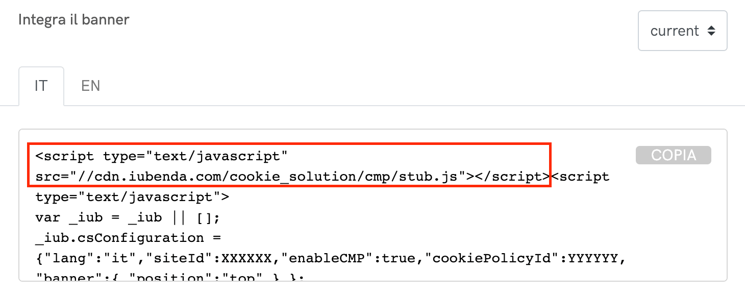
<div class="text-center py-5 hide-from-amp">
    <a href="#" data-toggle="modal" data-target="#imgModal">Link that opens a modal window</a>
</div>

<div class="modal fade" id="imgModal" tabindex="-1" role="dialog" aria-labelledby="imgModalLabel" aria-hidden="true">
    <div class="modal-dialog modal-lg" role="document">
        <div class="modal-content">
            <div class="modal-header">
                <h5 class="modal-title" id="exampleModalLabel">Modal title</h5>
                <button type="button" class="close" data-dismiss="modal" aria-label="Close">
                    <span aria-hidden="true">×</span>
                </button>
            </div>
            <div class="modal-body">
                <img src="https://www.iubenda.com/wp-content/uploads/2018/08/cookie-solution-cmp-stub-it.png" />
            </div>
        </div>
    </div>
</div>
Result:
Button / embed content – CodePen
Code:
<"text-center py-5 hide-from-amp">
    <a class="btn btn-dark-gray txt-dark sans-serif" href="#" data-toggle="modal" data-target="#codepenModal">Open a modal with CodePen embed</a>
</div>

<div class="modal fade" id="codepenModal" tabindex="-1" role="dialog" aria-labelledby="codepenModalLabel" aria-hidden="true">
    <div class="modal-dialog modal-lg" role="document">
        <div class="modal-content">
            <div class="modal-header">
                <h5 class="modal-title" id="exampleModalLabel">Modal title</h5>
                <button type="button" class="close" data-dismiss="modal" aria-label="Close">
                    <span aria-hidden="true">×</span>
                </button>
            </div>
            <div class="modal-body">
                <p class="codepen" data-height="500" data-theme-id="0" data-slug-hash="yELBdd" data-default-tab="html,result" data-user="iubenda" data-pen-title="[Iubenda Cons] Multiple Form implementation">See the Pen <a href="https://codepen.io/iubenda/pen/yELBdd/">[Iubenda Cons] Multiple Form implementation</a> by iubenda (<a href="https://codepen.io/iubenda">@iubenda</a>) on <a href="https://codepen.io">CodePen</a>.</p>
                <script async="" src="https://static.codepen.io/assets/embed/ei.js"></script>
            </div>
        </div>
    </div>
</div>
Result:
Paths
Dashboard > [your website] > Edit/Add privacy policy > Add service > Create custom service
Quotes
Add a
font-italicclass to italicize text.Maecenas faucibus mollis interdum. Curabitur blandit tempus porttitor.
For SEO purposes, it’s a good habit to add the URL of the source, if any.
Code:
<blockquote class="wp-block-quote font-italic" cite="https://www.google.com/adsense/new/localized-terms">
    <p>You will ensure that at all times you use the Services...</p>
</blockquote>
Result:
You will ensure that at all times you use the Services, the Properties have a clearly labeled and easily accessible privacy policy that provides end users with clear and comprehensive information about cookies, device-specific information, location information and other information stored on, accessed on, or collected from end users’ devices in connection with the Services, including, as applicable, information about end users’ options for cookie management.
Related articles
Use
h3(possibly withdata-toc-skip) for the title andulfor the list of links.Code:
<h3 data-toc-skip="">See also</h3>
<ul>
<li><a href="#">Donec id elit non mi porta gravida at eget metus</a></li>
<li><a href="#">Integer posuere erat a ante venenatis dapibus posuere velit aliquet</a></li>
<li><a href="#">Donec ullamcorper nulla non metus auctor fringilla</a></li>
</ul>
Result:
See also
- Donec id elit non mi porta gravida at eget metus
- Integer posuere erat a ante venenatis dapibus posuere velit aliquet
- Donec ullamcorper nulla non metus auctor fringilla
If you’re writing a “blog-style” shortpost, add
class="sp-see-also"class to theh3and theuland you’ll get this result (OFC remember to add the CSS for short “blog” posts reusable block).
Tables
Add
table table-borderedclasses to the table block:Code:
<table class="table table-bordered">
    <thead>
        <tr>
            <th>First</th>
            <th>Last</th>
        </tr>
    </thead>
    <tbody>
        <tr>
            <td>Mark</td>
            <td>Otto</td>
        </tr>
        <tr>
            <td>Jacob</td>
            <td>Thornton</td>
        </tr>
        <tr>
            <td>Larry</td>
            <td>Bird</td>
        </tr>
    </tbody>
</table>
Result:
First Last Mark Otto Jacob Thornton Larry Bird Spec
Add
tr-indent-[FROM 1 TO 4]class to each single<tr>that you want padded left.Code:
<div class="table-spec">
    <table>
        <tbody>
            <tr>
                <th>Key</th>
                <th>Type</th>
                <th></th>
            </tr>
            <tr>
                <td class="code-font">form</td>
                <td>Object</td>
                <td></td>
            </tr>
            <tr class="tr-indent-1">
                <td class="code-font">map</td>
                <td>Object</td>
                <td>Object allowing to map Consent attributes</td>
            </tr>
            <tr class="tr-indent-2">
                <td class="code-font">subject</td>
                <td>Object</td>
                <td></td>
            </tr>
            <tr class="tr-indent-3">
                <td class="code-font">id</td>
                <td>String</td>
                <td>name attribute of a DOM element present in the form</td>
            </tr>
            <tr class="tr-indent-4">
                <td class="code-font">...</td>
                <td>...</td>
                <td>...</td>
            </tr>
        </tbody>
    </table>
</div>
Result:
Key Type form Object map Object Object allowing to map Consent attributes subject Object id String name attribute of a DOM element present in the form … … … Responsive
Use
<div class="table-responsive-xl">...</div>to create responsive tables up to a particular breakpoint. From that breakpoint and up, the table will behave normally and not scroll horizontally.Code:
<div class="table-responsive-xl">
    <table class="table table-bordered">
        ...
    </table>
</div>
Result:
First Last Heading Heading Heading Heading Heading Heading Mark Otto Cell Cell Cell Cell Cell Cell Jacob Thornton Cell Cell Cell Cell Cell Cell Larry Bird Cell Cell Cell Cell Cell Cell GDPR Cookie Consent Cheatsheet
On the help:
- GDPR Cookie Consent Cheatsheet (id 23672)
- GDPR e consenso ai cookie – Tabella riassuntiva (id 28395)
Since these are very customized and delicate tables, always refer to these two codepens (and edit them if necessary, so that they are always up to date):
- EN table https://iubenda.link/en-pen-table
- IT table https://iubenda.link/it-pen-table
Tabs
Pay attention to
idandhref.Code:
<ul class="nav nav-tabs" id="myTab" role="tablist">
    <li class="nav-item">
        <a class="nav-link active" id="home-tab" data-toggle="tab" href="#home" role="tab" aria-controls="home" aria-selected="true">Home</a>
    </li>
    <li class="nav-item">
        <a class="nav-link" id="profile-tab" data-toggle="tab" href="#profile" role="tab" aria-controls="profile" aria-selected="false">Profile</a>
    </li>
    <li class="nav-item">
        <a class="nav-link" id="contact-tab" data-toggle="tab" href="#contact" role="tab" aria-controls="contact" aria-selected="false">Contact</a>
    </li>
</ul>

<div class="tab-content py-4 mb-4" id="myTabContent">
    <div class="tab-pane fade show active" id="home" role="tabpanel" aria-labelledby="home-tab">
        <p>...</p>
    </div>
    <div class="tab-pane fade" id="profile" role="tabpanel" aria-labelledby="profile-tab">
        <p>...</p>
    </div>
    <div class="tab-pane fade" id="contact" role="tabpanel" aria-labelledby="contact-tab">
        <p>...</p>
    </div>
</div>
Result:
Donec id elit non mi porta gravida at eget metus. Nullam quis risus eget urna mollis ornare vel eu leo. Praesent commodo cursus magna, vel scelerisque nisl consectetur et. Curabitur blandit tempus porttitor. Nullam quis risus eget urna mollis ornare vel eu leo. Integer posuere erat a ante venenatis dapibus posuere velit aliquet.
Maecenas faucibus mollis interdum. Morbi leo risus, porta ac consectetur ac, vestibulum at eros. Morbi leo risus, porta ac consectetur ac, vestibulum at eros. Duis mollis, est non commodo luctus, nisi erat porttitor ligula, eget lacinia odio sem nec elit. Donec ullamcorper nulla non metus auctor fringilla. Aenean lacinia bibendum nulla sed consectetur. Aenean lacinia bibendum nulla sed consectetur.
Cras mattis consectetur purus sit amet fermentum. Praesent commodo cursus magna, vel scelerisque nisl consectetur et. Fusce dapibus, tellus ac cursus commodo, tortor mauris condimentum nibh, ut fermentum massa justo sit amet risus. Donec ullamcorper nulla non metus auctor fringilla. Nulla vitae elit libero, a pharetra augue. Duis mollis, est non commodo luctus, nisi erat porttitor ligula, eget lacinia odio sem nec elit. Praesent commodo cursus magna, vel scelerisque nisl consectetur et.
ToC / Anchor links
Add this HTML at the top of the post to enable the ToC (visible on 1600+ px screen width, disabled by default, based on this Bootstrap plugin):
<div data-toc-activator></div>With ToC enabled, you get automatic anchor links on
h2andh3(noidneeded, but you can specify customidmanually if you want).Customization
Displayed text
By default, Bootstrap TOC will use the text from the heading element in the table of contents. If you want to customize what is displayed, add a
data-toc-textattribute with the desired text. For example:<h2 data-toc-text="Short text">Longer text</h2>displays “Longer text” as the heading, but “Short text” in the sidebar.
Skipping
To prevent a particular heading from being added to the table of contents, add a
data-toc-skipboolean attribute. Particularly useful for “Title + CTA” blocks (e.g. Create a pp for Google Analytics + Start generating)<h2 data-toc-skip>Some heading you don't want in the nav</h2>