Your newsletter header can make or break your conversion rates. Here’s what you absolutely need to know to craft the perfect one!
Newsletter headers are one of the biggest deciding factors affecting email open rates, so crafting an engaging header is critical to your email marketing campaigns.
Your newsletter header essentially serves as a “headline” or “banner“, stating the topic of your newsletter. It is the first thing your audience sees when they open your email, making it a vital tool for capturing their attention and making sure they keep reading! Needless to say, it plays a key role in driving opens and conversions.
👀 To ensure that your newsletter header hits the mark, we’ve compiled a comprehensive guide that covers the main Dos and Don’ts of newsletter header creation.
Short on time? Jump to… ⬇️
What is the layout of a newsletter?
A newsletter should start with an attention-grabbing subject line and header, including your company logo for brand identity and a title to announce the main topic. You can consider adding an introduction to summarize key points, potentially followed by a table of contents for easy navigation.
The body should be divided into sections, each focused on a specific topic. Make sure to use headlines, subheadings, bullet points, and relevant visuals to enhance readability and engagement. Place your primary call-to-action (CTA) prominently within these sections.
End with a footer containing useful links, contact info, and social media buttons. Include an unsubscribe link for legal compliance. Ensure your layout is responsive and mobile-friendly, testing it on various devices before sending.
What is a newsletter header?
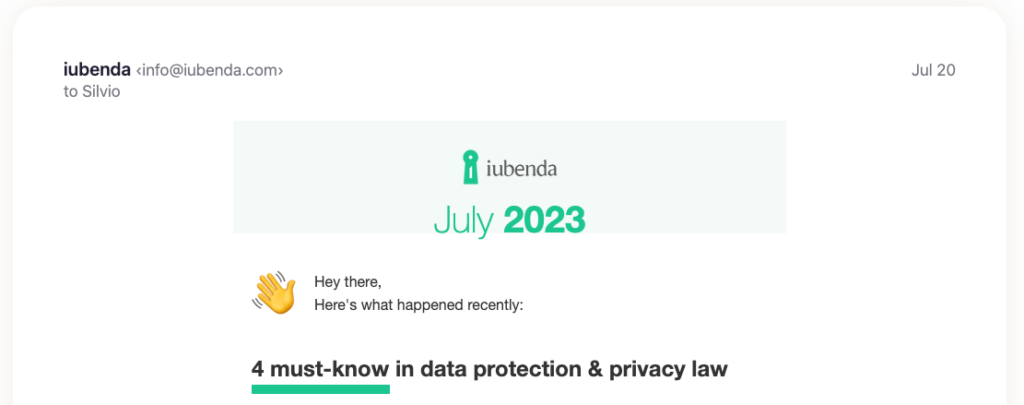
A newsletter header serves as the introductory section of your email newsletter. It’s the first visual element that recipients see when they open your email, usually with your organization’s logo and the title of your newsletter or main topic. The header sets the tone for the rest of the email and is crucial for brand recognition and reading rate.
Besides visual appeal, a newsletter header should be straightforward and descriptive enough to give readers an instant understanding of the content that follows. Keep in mind, the header, similar to the subject line, plays a significant role in grabbing the reader’s attention.
What should be in the header of a newsletter?
Your newsletter header should ideally contain your brand logo, a title that represents the newsletter’s content, and occasionally, a tagline or a call-to-action (CTA). The goal here is to inform your recipients about the email’s source and hint at its content in a short and compelling manner. You can also mention the issue number or date.
How do I make a newsletter banner?
A good newsletter banner is a balance of clean design and clear messaging. You can use any design tool, like Canva for example, or your own design software that you might commonly use for other design activities. Email marketing solutions like HubSpot or Substack also have their own integrated tools for curating the look of your email and host a number of customizable newsletter header designs.
Choose a design that aligns with your brand aesthetics, then add your logo, a suitable title, and any other relevant text or image. Make sure it’s visually appealing but not overly cluttered.
👋 Want to set up your newsletter on Mailchimp?
Newsletter Header Dos and Don’ts
✅ DO: Keep Your Branding Consistent
Consistent branding in your newsletter headers helps build recognition among your subscribers. This includes:
- logo placement,
- font selection,
- color schemes, and
- imagery that reflects your brand identity.
💡 A consistent brand image ensures that your newsletters are instantly recognizable. Try to be consistent for each issue of your marketing newsletter, so to create continuity.
❌ DON’T: Overcrowd Your Newsletter Header
While it’s crucial to include a few essential elements in your header banner, avoid overcrowding it.
Too much information or overly intricate designs can confuse your readers and detract from your message, thus risking that they stop reading through. Stick to simplicity: include your logo, a concise title, and if necessary, a punchy CTA.
Remember, your goal is to pique interest, not to provide all information at a glance.
✅ DO: Optimize for Mobile Devices
It is very likely your subscribers will be opening your email newsletter from their phone. That’s why ensuring your newsletter header design is mobile-friendly is critical. Thus, your header should be easily readable and visually engaging on smaller screens. As this study by Mailchimp shows, responsive design can improve engagement by ensuring your header looks good regardless of the device.
❌ DON’T: Neglect the Power of Color
The overall design of your banner will be significantly influenced by colors. Using the wrong colors or too many can be off-putting. Use your brand colors strategically to draw attention and create an emotional connection, not to overshadow your content or clash with your overall newsletter design.
✅ DO: Use High-Quality Images
When used correctly, images are a powerful component of newsletter headers. They can help convey your message, set the tone for your content, and make your newsletter visually appealing. Always opt for high-quality images that align with your content and brand. Same here, don’t use visuals that show a mix of too many colors or elements all together.
❌ DON’T: Ignore the Importance of Typography
Make sure your title and any other text elements in your header are legible and visually pleasing. Avoid using too many different fonts, which can look chaotic and unprofessional.
✅ DO: Include a Clear Call-to-Action
Including a clear, concise call-to-action (CTA) in your newsletter header is a great trick you can use for improving your click-through-rate. In fact, readers are more likely to click early in the email, rather than at the end.
Your CTA should tell subscribers what you want them to do next, whether it’s reading an article, use a discount code or learn about a new product.
💡 Not inspired? Here are 50 power call-to-action phrases to boost your conversions.
❌ DON’T: Forget to A/B Test Your Newsletter Header
With A/B testing (which goal is to compare two different versions of your header), you can get some amazing insights as to how your newsletter headers are performing, which version works the best and what you can still improve. You can test many elements like colors, fonts, CTAs, or imagery.
✅ DO: Tailor Your Header Banner to Your Audience
Just as the content of your newsletter should be tailored to your audience, so should your header design. Whether you’re crafting an HR newsletter for internal employees or a promotional newsletter for potential customers, the header should resonate with the target reader’s interests and expectations.
For example, a company newsletter might benefit from a professional, straightforward header featuring the company logo and a clear title indicating the content. On the other hand, a marketing newsletter targeting young consumers might require a more vibrant, playful header that uses bold colors.